Project End Date: 10/02/2024
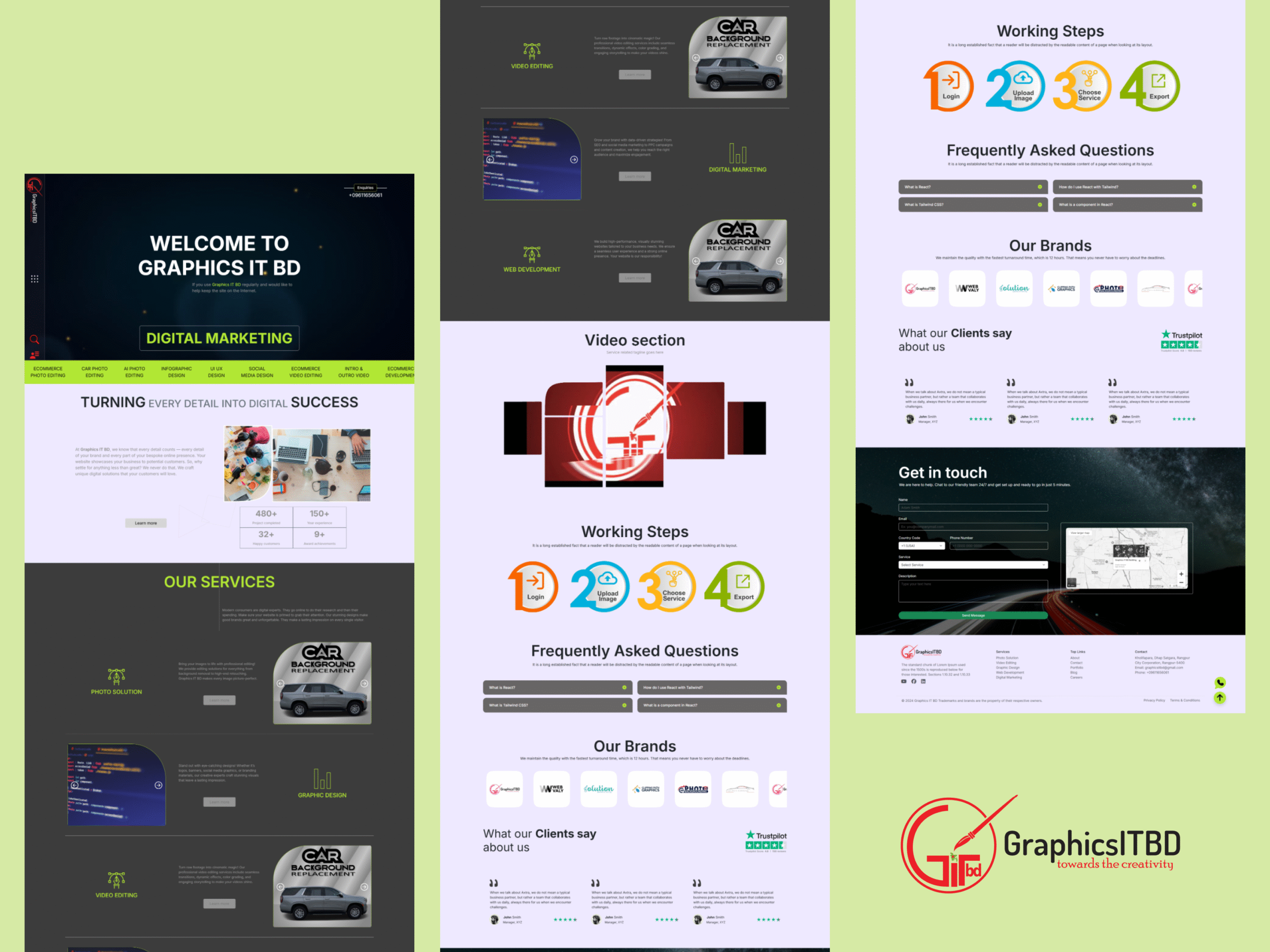
Graphics IT BD website
-
By admin
-
June 21, 2025
Premium UI design with User experience of an IT agency company.
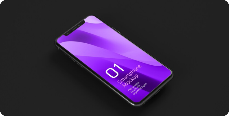
The basic idea was to find a balance between the thin, wispy sans-serif used to indicate a ‘futuristic‘ tone, and a bold,
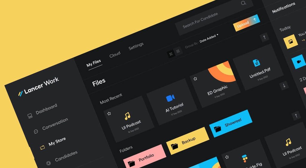
UI/UX design
-
By admin
-
July 29, 2024
The basic idea was to find a balance between the thin, wispy sans-serif used to indicate a ‘futuristic‘ tone, and a bold, masculine font synonymous with ‘construction‘. We came up with something in the middle, leaning towards lighter-weighted fonts, but still with a hint of that blocky ‘construction’ vibe.
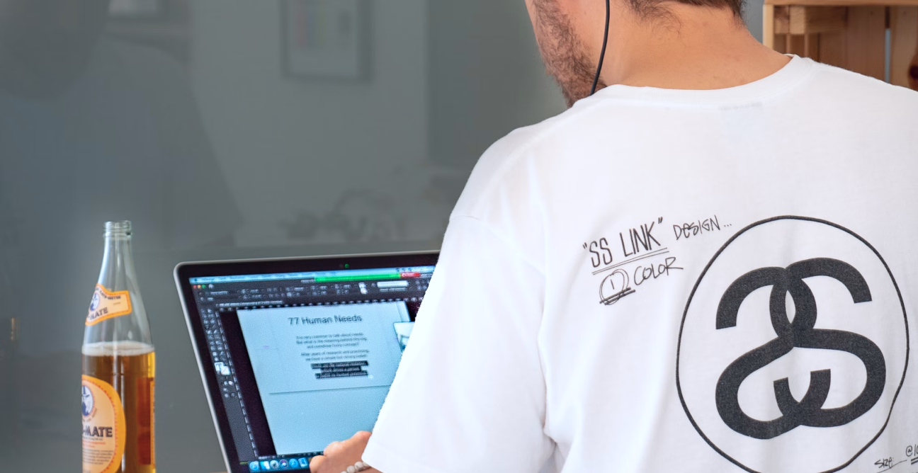
Oxilex Apps
-
By admin
-
July 29, 2024
The basic idea was to find a balance between the thin, wispy sans-serif used to indicate a ‘futuristic‘ tone, and a bold, masculine font synonymous with ‘construction‘. We came up with something in the middle, leaning towards lighter-weighted fonts, but still with a hint of that blocky ‘construction’ vibe.
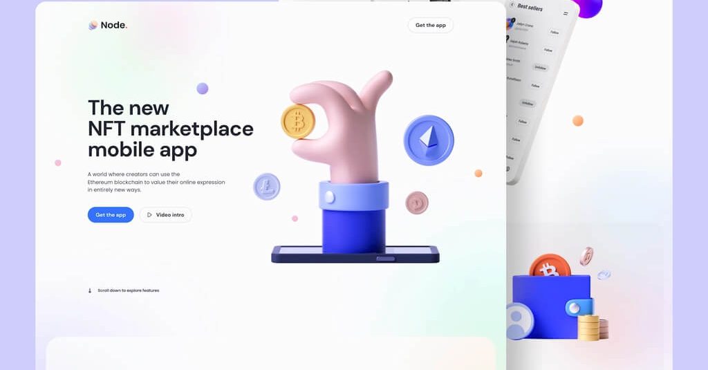
Brand identity
-
By admin
-
July 29, 2024
The basic idea was to find a balance between the thin, wispy sans-serif used to indicate a ‘futuristic‘ tone, and a bold, masculine font synonymous with ‘construction‘. We came up with something in the middle, leaning towards lighter-weighted fonts, but still with a hint of that blocky ‘construction’ vibe.
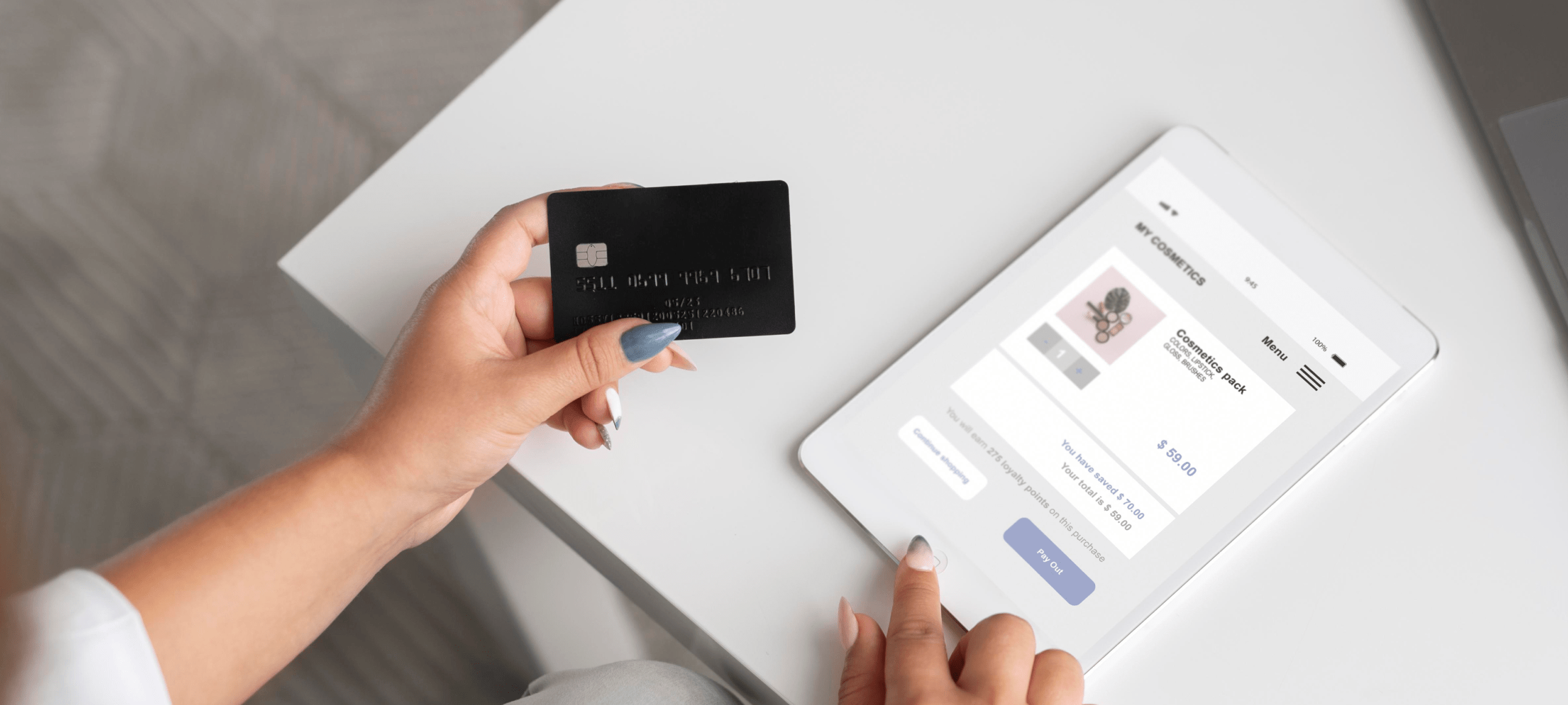
Basinik Finance App
-
By admin
-
July 29, 2024
The basic idea was to find a balance between the thin, wispy sans-serif used to indicate a ‘futuristic‘ tone, and a bold, masculine font synonymous with ‘construction‘. We came up with something in the middle, leaning towards lighter-weighted fonts, but still with a hint of that blocky ‘construction’ vibe.

Brand identity
-
By admin
-
July 22, 2024
The basic idea was to find a balance between the thin, wispy sans-serif used to indicate a ‘futuristic‘ tone, and a bold, masculine font synonymous with ‘construction‘. We came up with something in the middle, leaning towards lighter-weighted fonts, but still with a hint of that blocky ‘construction’ vibe.

UI/UX design
-
By admin
-
July 22, 2024
The basic idea was to find a balance between the thin, wispy sans-serif used to indicate a ‘futuristic‘ tone, and a bold, masculine font synonymous with ‘construction‘. We came up with something in the middle, leaning towards lighter-weighted fonts, but still with a hint of that blocky ‘construction’ vibe.

Oxilex Apps
-
By admin
-
July 22, 2024
The basic idea was to find a balance between the thin, wispy sans-serif used to indicate a ‘futuristic‘ tone, and a bold, masculine font synonymous with ‘construction‘. We came up with something in the middle, leaning towards lighter-weighted fonts, but still with a hint of that blocky ‘construction’ vibe.

Basinik Finance App
-
By admin
-
July 18, 2024
The basic idea was to find a balance between the thin, wispy sans-serif used to indicate a ‘futuristic‘ tone, and a bold, masculine font synonymous with ‘construction‘. We came up with something in the middle, leaning towards lighter-weighted fonts, but still with a hint of that blocky ‘construction’ vibe.
